Learn Excel Formulas and Charts: From Calculations to Data Visualization
About Course
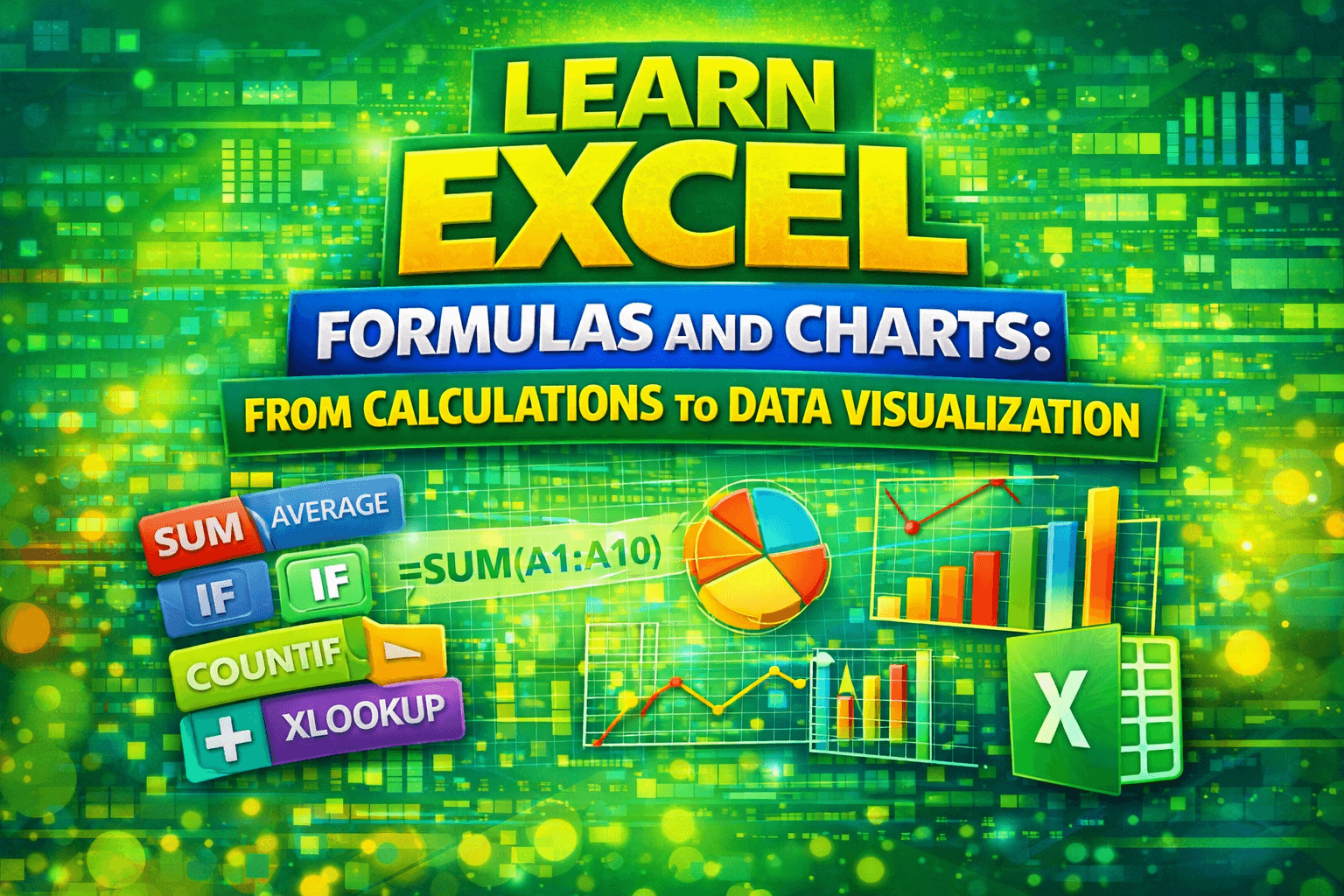
Learn how to analyze, calculate, and visualize data in Microsoft Excel using the most powerful formulas and charts used in real-world data analysis.
This course is designed to help you move from basic Excel usage to performing meaningful data analysis and professional-level reporting. You will learn essential functions such as SUM, AVERAGE, COUNT, IF statements, and advanced lookup functions like VLOOKUP, HLOOKUP, and XLOOKUP.
Beyond calculations, this course focuses heavily on data visualization, teaching you how to create charts such as bar charts, pie charts, line charts, histograms, scatter plots, and more. You will also learn how to format and decorate charts to make your reports clear, impactful, and professional.
By the end of this course, you will be able to analyze data, extract insights, and present them visually, making you job-ready for roles such as data analyst, business analyst, reporting analyst, and financial analyst.
Course Content
Basic to Advanced Formulas and Functions
-
Datasets for excel practices
-
SUM, AVERAGE, MIN, and MAX
09:43 -
SUMIF, and AVERAGEIF
08:33 -
COUNT, COUNTA, and COUNTIF
08:05 -
YEAR, MONTH and DAY
03:42 -
IF STATEMENTs for conditional operation
10:43 -
VLOOKUP for column-wise insight search
06:57 -
HLOOKUP for row-wise insight search
07:00 -
XLOOKUP for robust & complex search
07:06
Data Visualization and Charts
Earn a certificate of your expertise!
Add this certificate to your resume to demonstrate your skills & increase your chances of getting noticed.